Interactivity
Interactivity is what separates static reports from real dashboards. Instead of just looking at data, users can click, filter, and explore on their own.
The goal is not to add as much interactivity as possible, but to add usefulness to the dashboard.
A good interactive dashboard lets someone answer follow-up questions without leaving the dashboard.
Slicers
Slicers let users filter data without touching the underlying model. Common uses:
- Date ranges
- Regions
- Product categories
Slicers should be easy to find and clearly labeled. If a slicer exists, it should have a clear purpose.
Cross Filtering and Highlighting
Power BI visuals interact with each other by default. When a user clicks one visual:
- Other visuals filter or highlight automatically
- Patterns and relationships become easier to spot
This is one of the most powerful features of Power BI and often requires no extra setup.
Drill Down and Drill Through
Drill features allow users to move between levels of detail. Drill down is useful for moving from:
- Year to month to day
- Category to subcategory
Drill through lets users right-click a data point and navigate to a detailed page focused on that item.
Drill features are great, but only if users know they exist.
Tooltips
Tooltips show extra information when users hover over a visual. They're useful for:
- Adding context without cluttering the dashboard
- Showing supporting metrics
- Providing definitions or explanations
Custom report page tooltips can add a lot of value when used carefully.
Assignment
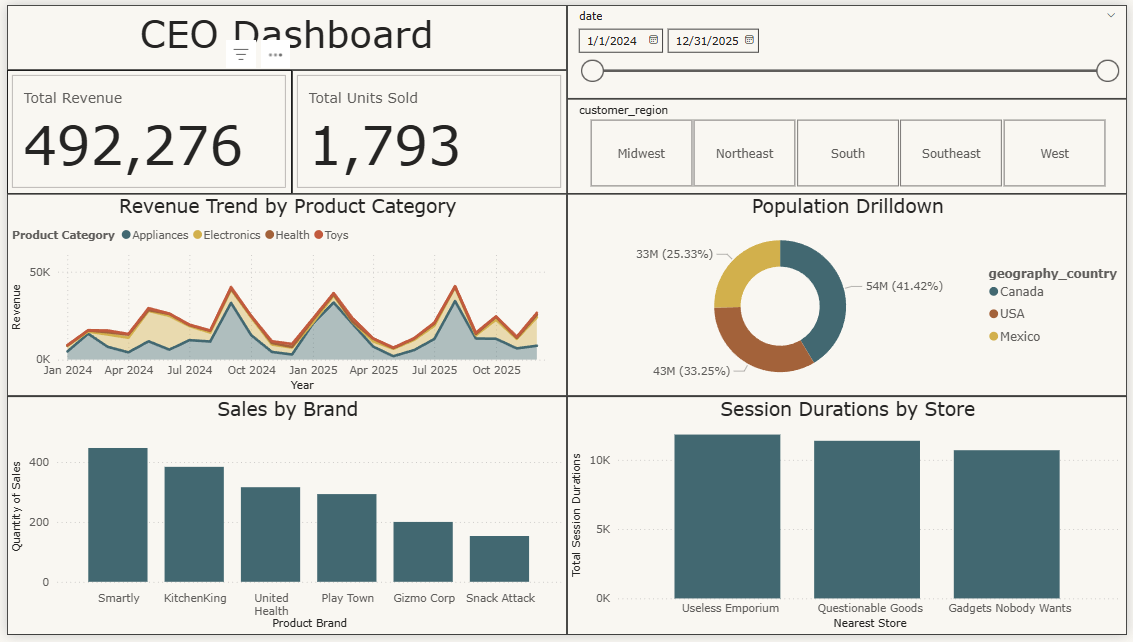
Let's add slicers to the Dashboard page so users can filter the data interactively.
-
-
Date slicers with the "Between" style let users select a custom date range, which is great for exploring trends.
-
The "Tile" style makes region selection feel more like buttons, which is easier for users to understand at a glance.
Save the project and, from the course directory, submit the CLI tests.