Organizing Charts
Remember, a good chart hierarchy looks like this:
- KPIs at the top
- Primary charts in the center
- Supporting details below or to the side
Assignment
Let's rearrange the components on our dashboard. Match the following layout:
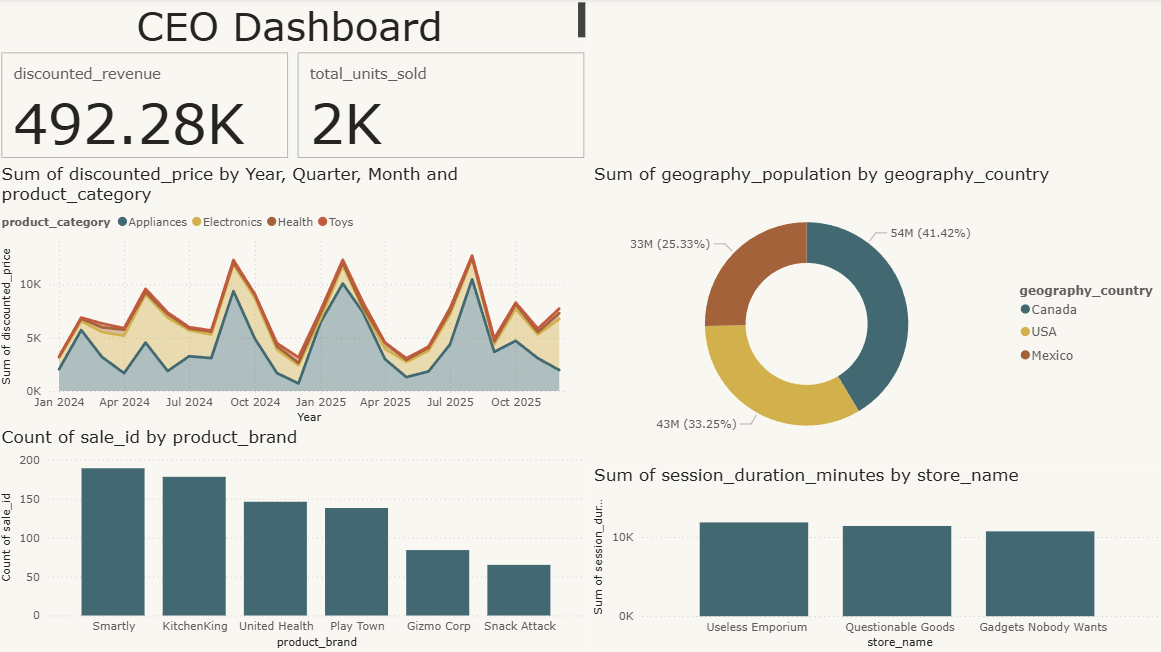
Notice how we're following the visual hierarchy: KPIs are at the top, and the most important chart (sales by category) takes the most room and calls attention to itself.
Save the project and, from the course directory, submit the CLI tests.